


reverie kombucha
reverie kombucha
BEVERAGE PACKAGING + BRANDING
Packaging Design — Fall 2024
I created a kombucha brand with flavors based on movie genres, and developed the concept for its brand mission and platform, then designed packaging for three of its flavors as well as a four-unit beverage carrier for one flavor.
Reverie Kombucha crafts beverages that will tell a story with every sip, with each flavor inspired by movie genres. Restore both your body and mind with an alternative to sugary drinks, and experience our unique flavors that will transport you to the magic of a world of stories and imagination. We use only authentic ingredients to ensure the highest quality kombucha, because your drink isn’t just a drink—it’s an experience.
brand mission
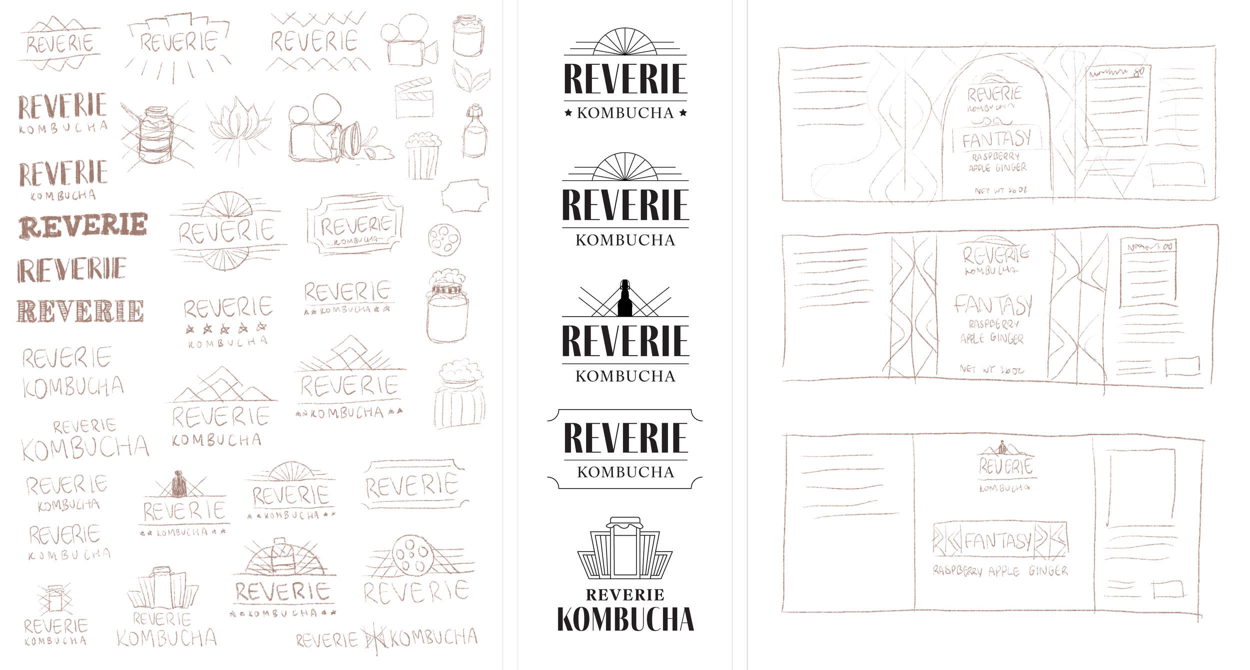
process
I took inspiration from the aesthetic of old movie theaters for the overall feel of the brand. I picked the name “Reverie” to go along with the idea of escapism, and decided to do a glass bottle with a rectangular label for the packaging form since that’s how kombucha is typically packaged.

font + color system
I wanted to combine the old movie theaters’ art deco elements with bright colors to put contrast between retro and modern, especially when examining other kombucha brands and how they approach their packaging.
I used the pink, purple, and blue as the main brand colors, with one more accent color to apply to each drink flavor.
final designs
promotional items
