2¢ guide & app
2¢ passion guide & app
SQUARE GUIDEBOOK AND APP PROTOTYPE
SPRING 2024 — TYPOGRAPHY II
This guidebook focuses on notable locations of pressed penny machines in San Diego and their history. The app prototype adapts the information from the book into a wayfinder to browse locations.

book process
To match the feel of old coins and hand-cranked machines, I designed this book to be a more vintage style, using textural elements and layering to create a complex layout that could hold a lot of information.
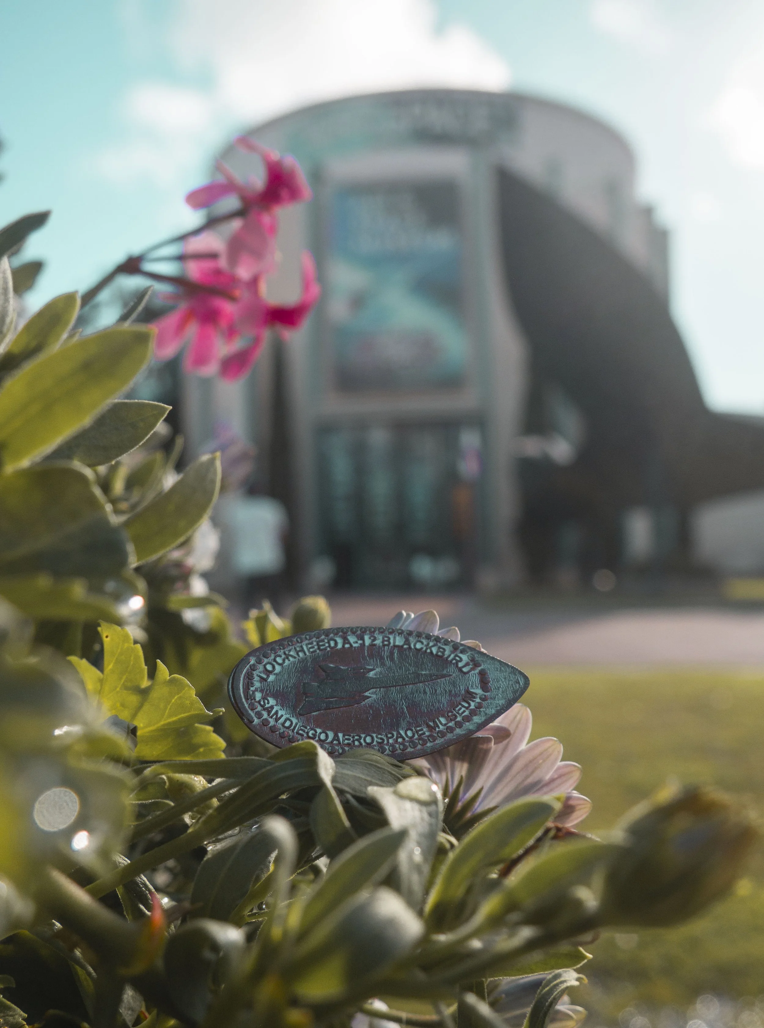
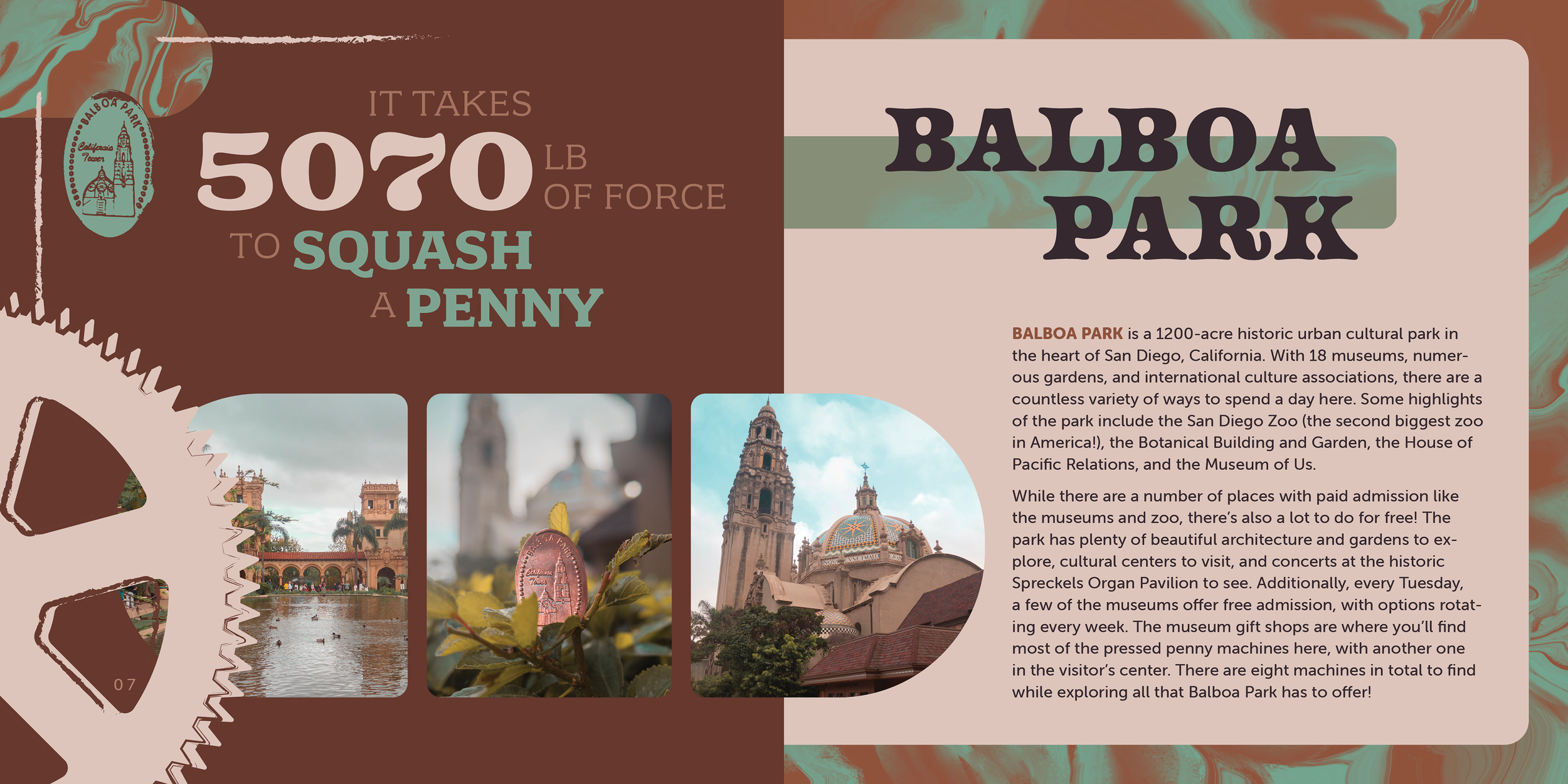
I wanted to use the actual pressed pennies as elements, and image traced the ones I’ve gotten from places in San Diego.

font + color system
Going along with my vision for the feel of the system, I used fonts that felt more vintage or western for the display type. For the body text, I found a sans serif font that would be readable both in print and on screen.
I also based the color palette off of pennies, using shades of copper and green like the aged patina of a coin.


app wireframe

After completing the guidebook, I worked on translating the concept to an app. It has pages mainly for browsing locations, checking off places the user has gotten a pressed penny from, and more detailed information about the locations themselves.
final app design
app prototype
imagery
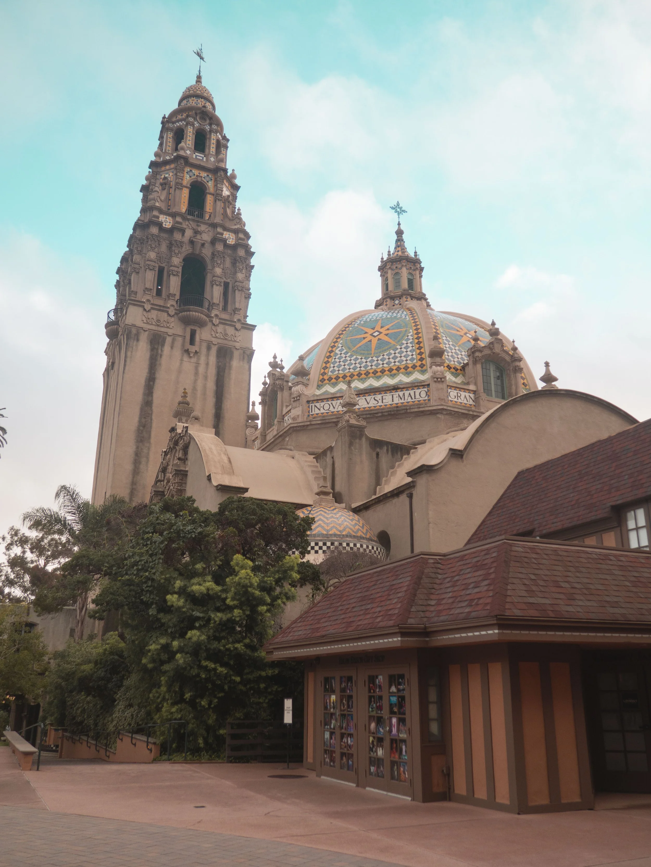
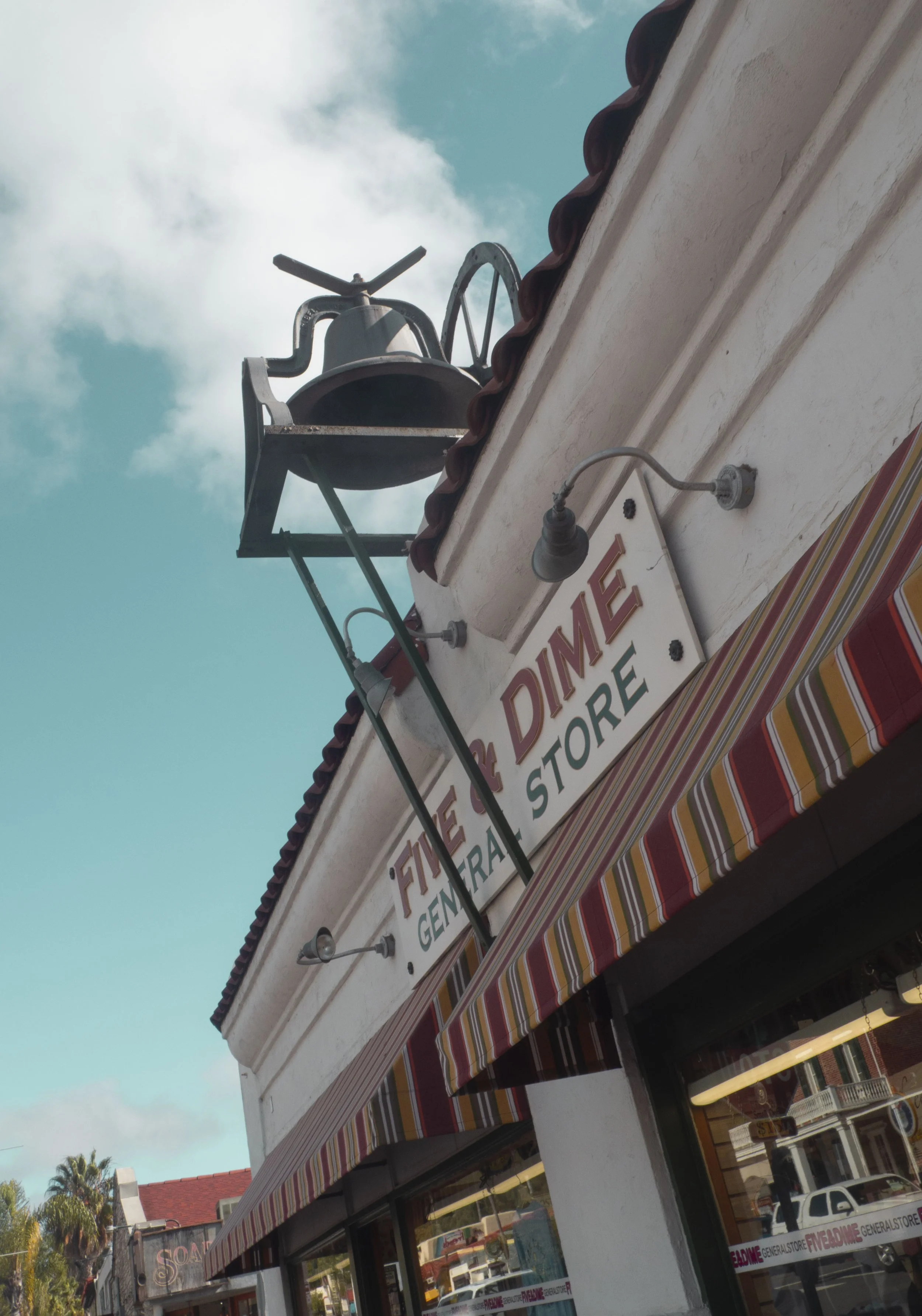
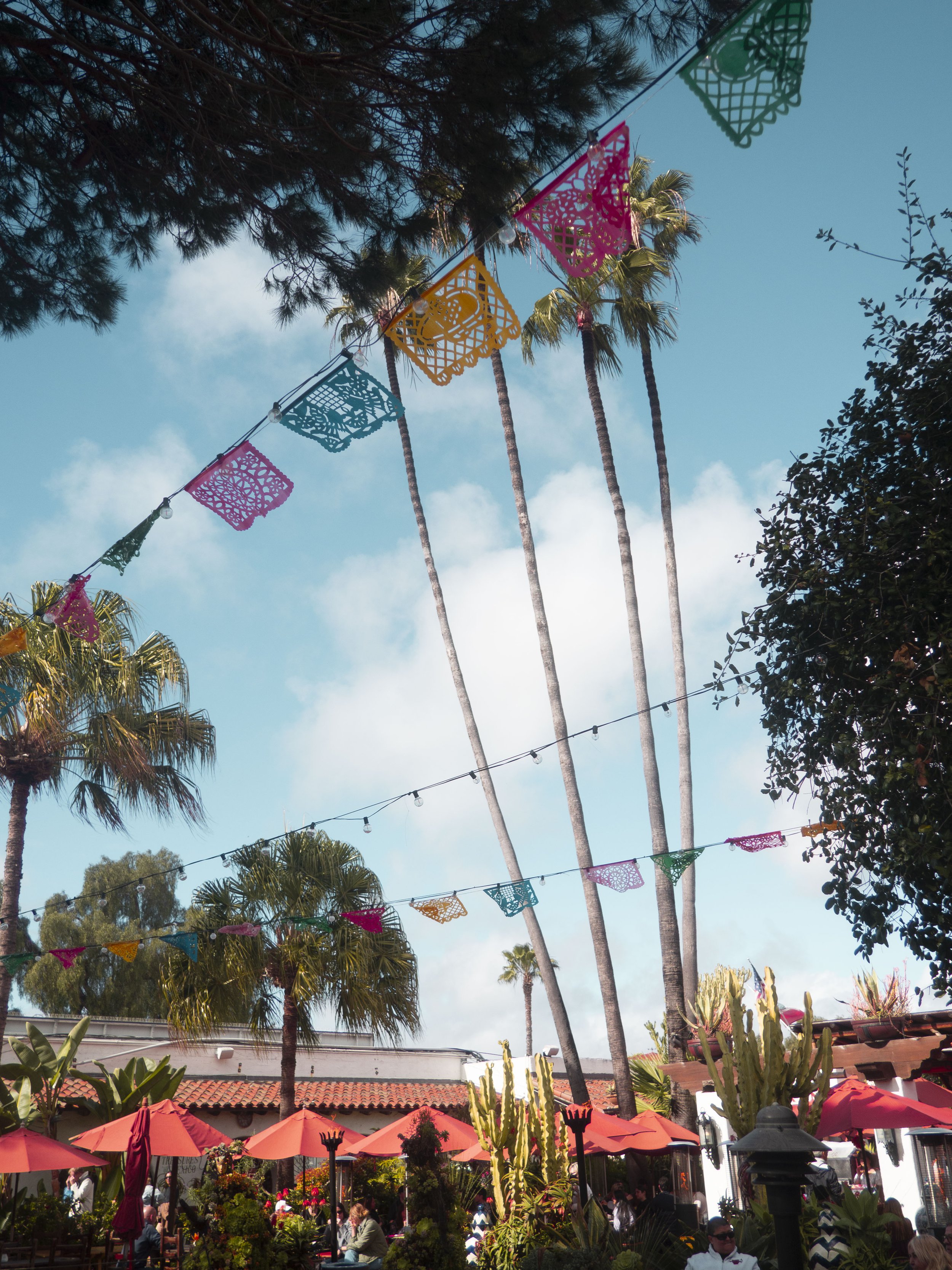
I decided to compose all the photos for this project myself using my Olympus E-M10 camera. I visited the locations I wanted to highlight so I could create specific imagery, and edit them so the colors would work well with the system overall.